A habit tracker
built for the bad day.
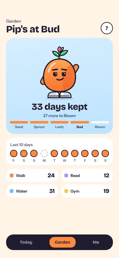
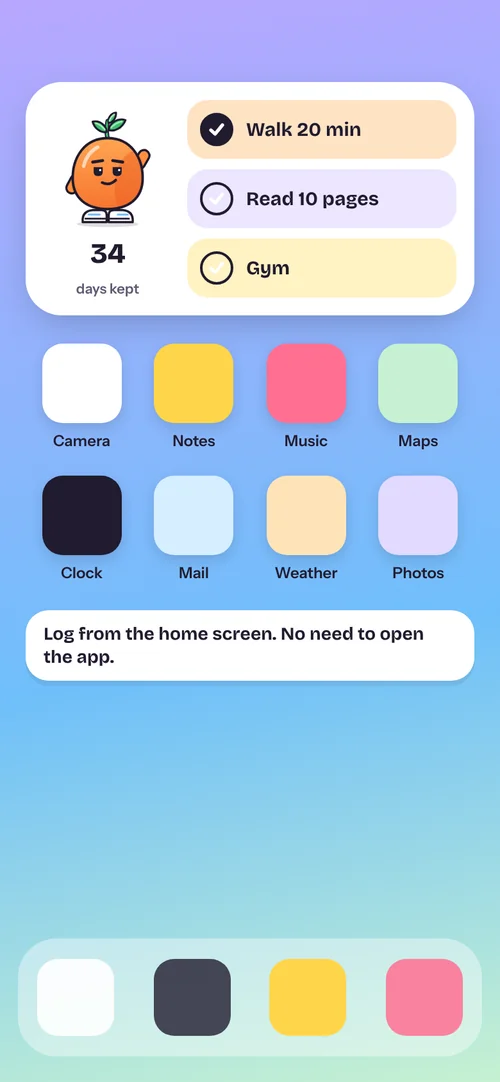
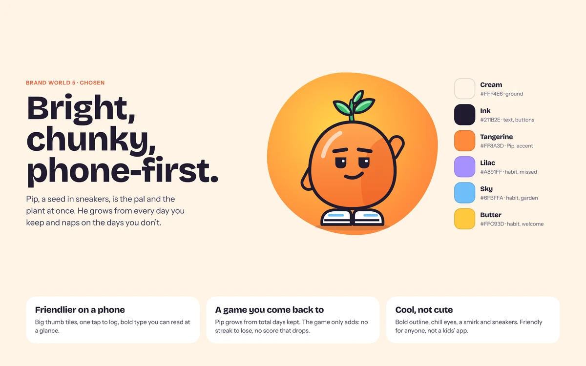
My first-year app, redone from its research. Logging is one tap, a missed day never wipes out the days you kept, and Pip, a seed in sneakers, grows out of every day you keep.
One file, three products.
When I came back to my first project two years later, my workshop board, my project plan and my interviews each described a different app. Before changing a single screen, I let the evidence pick one.
Four people who tried to build a habit.
Semi-structured interviews with students and young workers aged 18 to 29, the people the app was for. Participants are anonymised as P1 to P4.
Walk me through a typical day.
Which habit were you trying to build?
How did you keep track of it?
What made you stop?
Three of four stopped within two weeks. None stopped on day one.
Everyone started with real intent. Keeping it going is what failed. Lengths are as each person described them, not logged data.
What the interviews said, underneath.
I grouped what people did, not what they wished for. Three patterns came out, and each one became a rule for the design.
Students and young workers (18–29) can't keep a habit going past the first couple of weeks, because logging it feels like an extra task when they're busy and tired, and missing one day wipes out their streak. Today they cope with paper, Notes or their calendar instead.
Three things I couldn't just remove.
Each finding pulled against another one. The design had to hold both sides.
The streak motivates some people and drives others away.
A streak rewards people who never slip and punishes the people who most need the app, at the moment they're most likely to leave. But removing progress would take away the visible record P1 and P2 found motivating.
Recording a miss costs a tap.
Without it, a blank day could mean "I didn't" or "I forgot to log". But every extra tap is the kind of task that made P3 quit.
A friendly pal can turn into pressure.
Habit-app characters often work through guilt: the owl that misses you, the pet that suffers. My own 2024 board had a tree that dies if you skip a check-in.
Every feature traces back to a person.
Each screen has one of two jobs: make logging quicker than paper, or make a missed day survivable. Pick a participant to see what came from them.
| Feature | P1 | P2 | P3 | P4 |
|---|
A miss moves the count by one, not back to zero.
This is the moment people quit, so it's where I spent the most time. Tap any day below to miss it and compare what each approach tells you.
One miss and it's back to zero.
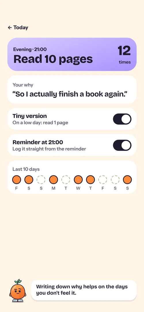
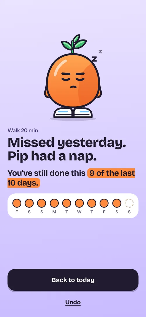
The last 10 days. A miss moves it by one.
Days kept in total. A miss: he naps.
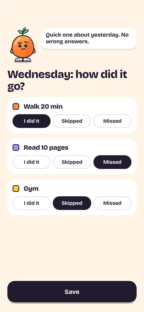
"Fail" becomes "Missed".
I kept the ability to record a miss, and changed the word and its weight. In 2024 a black Fail button was the boldest thing on the row. The morning after an unlogged day, Tally now asks what happened, with three equal answers. Skipped covers planned days off, which P4 asked for, and doesn't count against you.
Show the effort kept, not what was lost.
I wrote three versions of the message after a miss. Pick one to see why it did or didn't make it.
A pal who is also the plant.
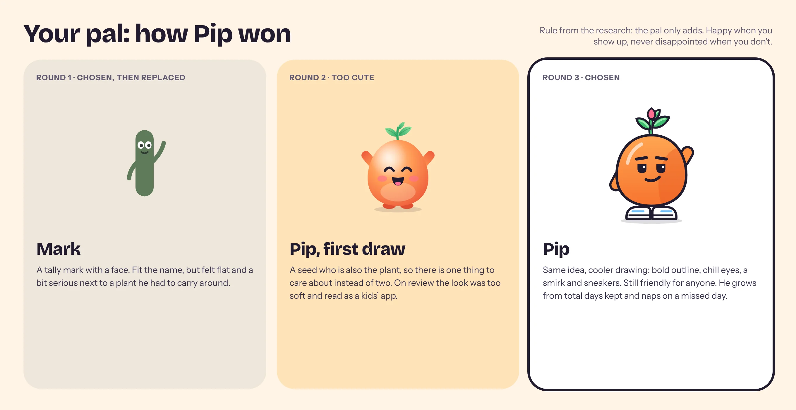
My brief asked for a pal, like Duolingo's owl but without the guilt. The pal went through three rounds before one character did both jobs: cheer you on, and show what you've grown.
Five stages, and only one direction.
P4 wanted something that grows as you keep going. P2 is motivated by visible progress. So Pip grows from every day you keep, and he can only go one way. Drag the slider, then try missing a day.
Never from days in a row. Any habit counts, tiny versions too. Seed, Sprout, Leafy, Bud, Bloom at 1, 7, 14, 30 and 60 days.
Log everything for the day and Pip throws his arms up. A new leaf on the next stage.
Eyes closed, a couple of z's. Tomorrow he's exactly as you left him.
No drooping, wilting, sad faces or crosses. What you grew stays grown.
One switch, not a morning quiz.
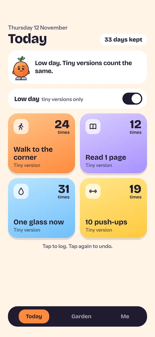
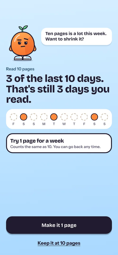
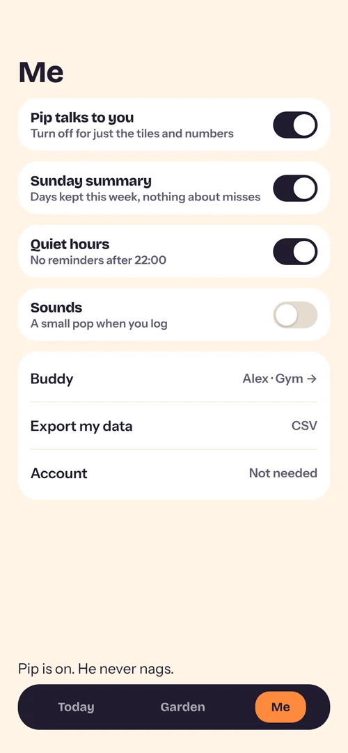
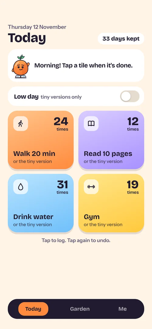
P2 said his habits fail on drained days. My first answer was a morning energy check-in with four answers (never mood, which would have pulled the app back towards the mental health product). On review it was a question every single morning, even on good days. Now it's one switch, off by default. Flip it and every habit drops to its tiny version, which counts the same.
The first version: four answers, every morning.
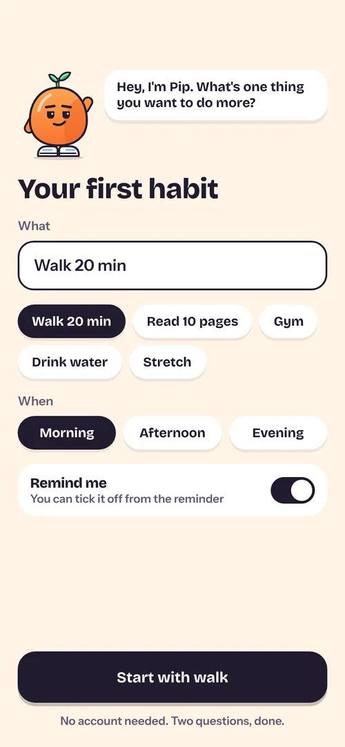
Quicker than paper.
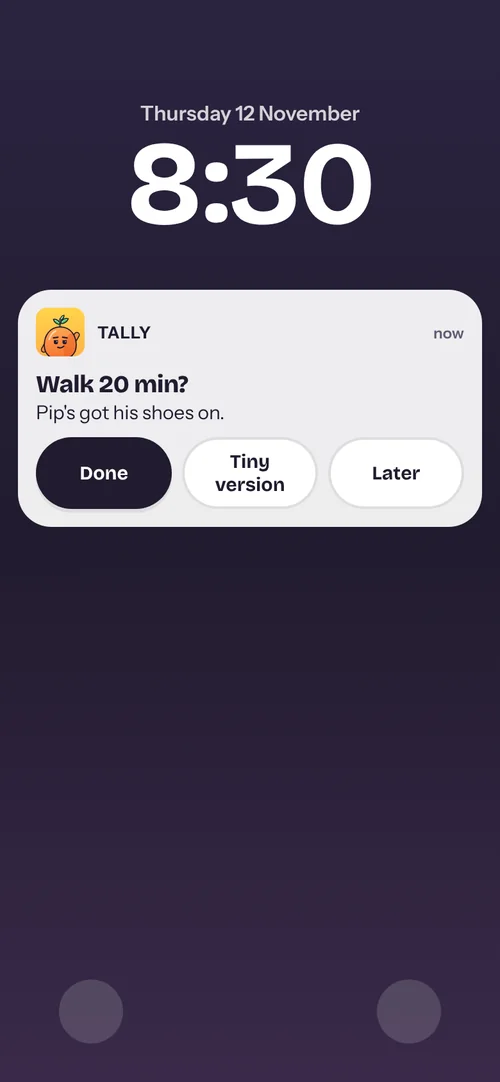
The first screen asks for the habit, not an account. Adding one takes two questions instead of eight. Logging is one tap on a big tile, from the app, the home-screen widget or the reminder. All of it came from P3 and P4.
Tap, go tiny, and a miss that naps.
The example data is the same on every screen: Thursday 12 November, 33 days kept, Walk logged 24 times, Read on a low week.
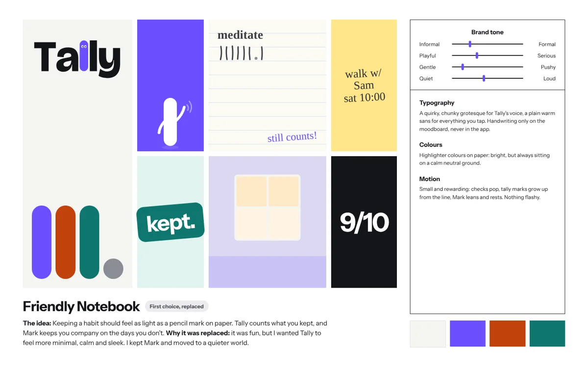
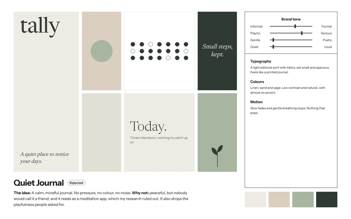
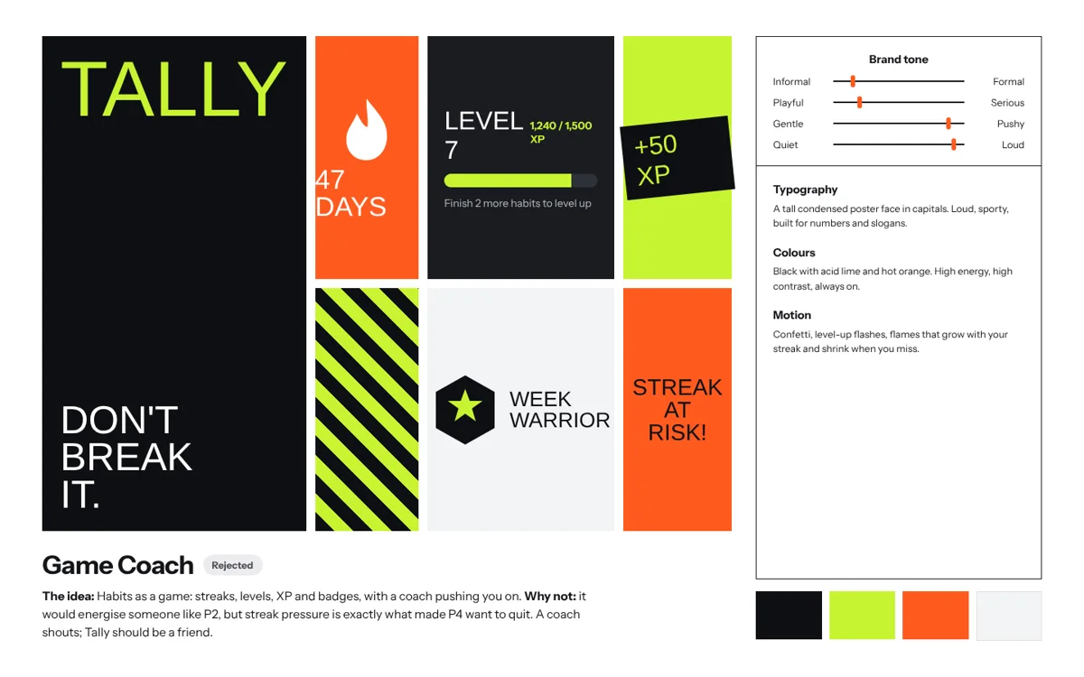
Five worlds, one chosen.
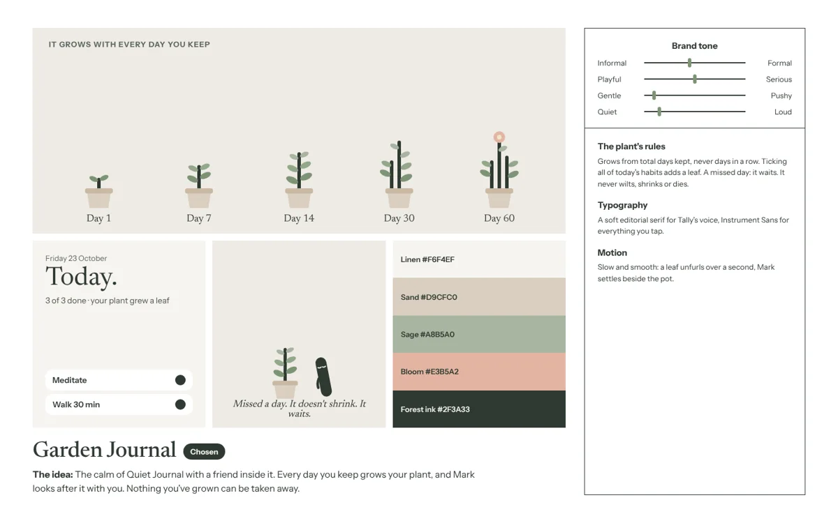
I explored five directions for how Tally should feel, each held against the research. Pick one to see why it stayed or went.
What the second look changed.
Same research, same people. The difference is that the redesign starts from the bad day.
| Moment | 2024 | 2026 |
|---|---|---|
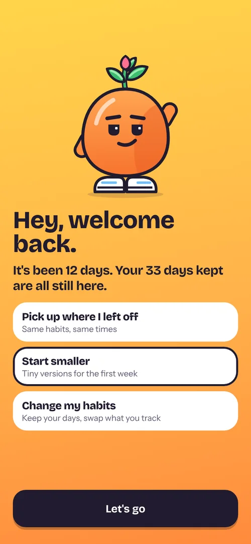
| Opening the app | Welcome, log-in and sign-up screens before anything else | Pip says hello and asks for a habit. The account is optional |
| Adding a habit | Eight empty fields with small labels | Name and time of day, with suggestions |
| Logging | A Done chip, with Delete, Skip and Fail behind a swipe | One tap on a big tile, from the app, widget or reminder |
| A missed day | A black "Fail" button and "Fail 13" on the stats card | Asks what happened. "Missed" shows the days kept |
| Progress | An unlabelled line chart and a streak counter | Pip grows, "9 of last 10" and a running total per habit |
| Bad days | Nothing. Same plan every day | A Low day switch with a tiny version of each habit |
| Personality | A stock illustration on the welcome screen | Pip, a seed in sneakers who is also the plant |
How I'd test it.
None of this has been tested with users yet. These are hypotheses, and this is how I'd check them.
What I didn't solve.
And what I'd do differently from day one.
P3, the oldest participant, wanted less in her way, not more. I redrew Pip cooler after the first drawing read as a kids' app, and he can be switched off in Me. Only testing will tell me if that's enough.
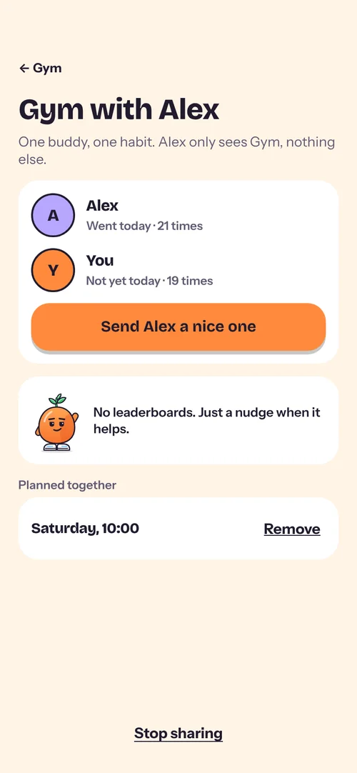
One buddy for one habit came from P2. It may help people like him and mean nothing to the rest.
Next time I'd ask "tell me about the last time you stopped tracking something" instead of "what feature do you wish existed?"
My first version spread across three ideas, and the brand went through five worlds. The research rules held the whole time; the look changed around them. One problem statement before any screens would have saved most of the rework.
My first version was designed for the good days. This one starts from the bad one, and gives it a friend.